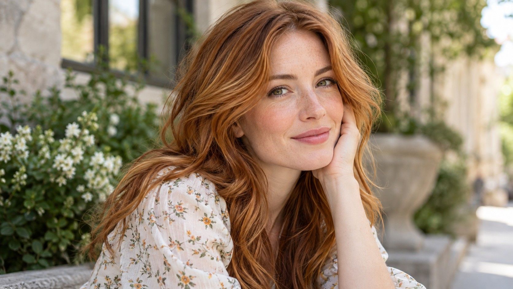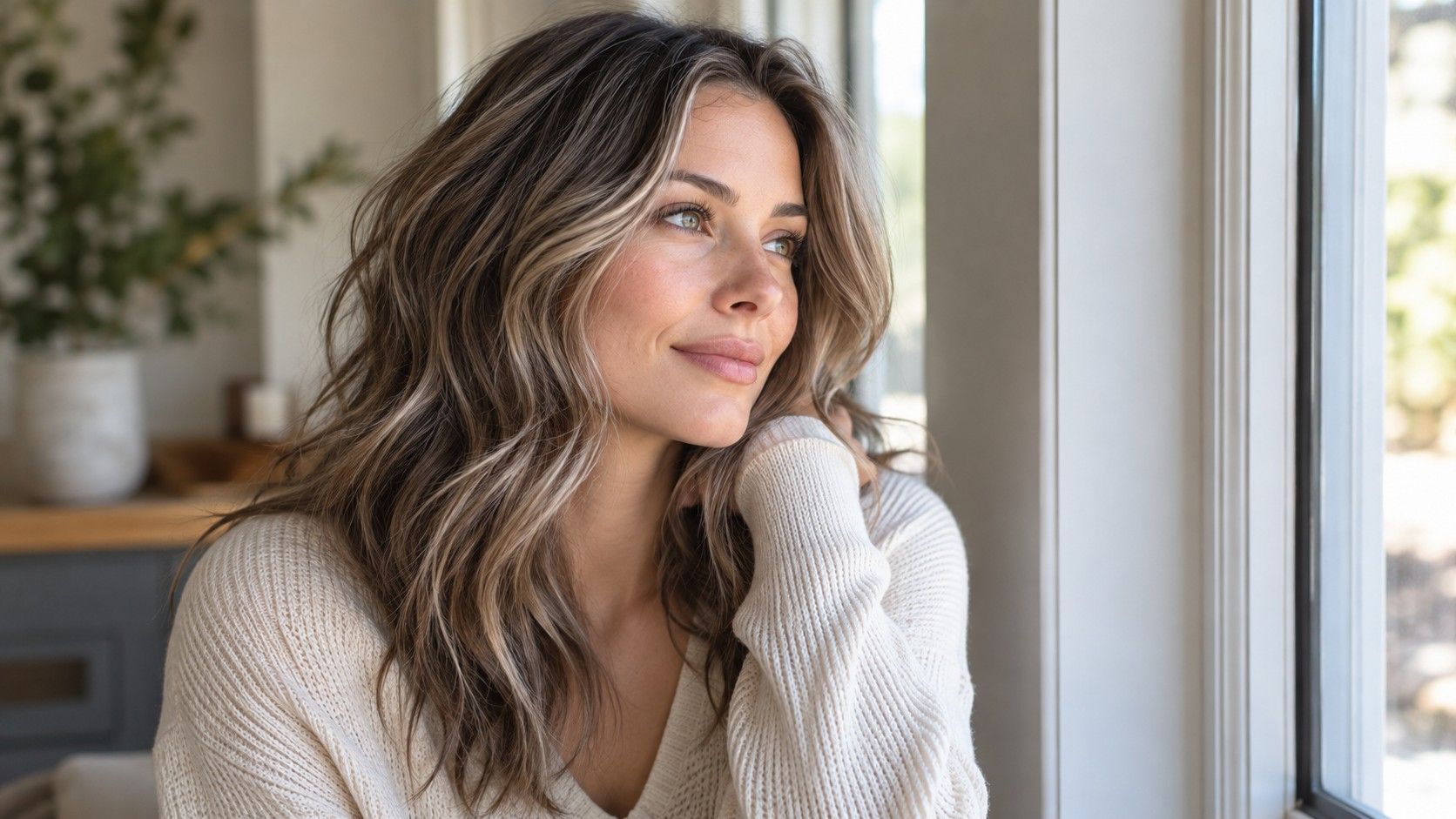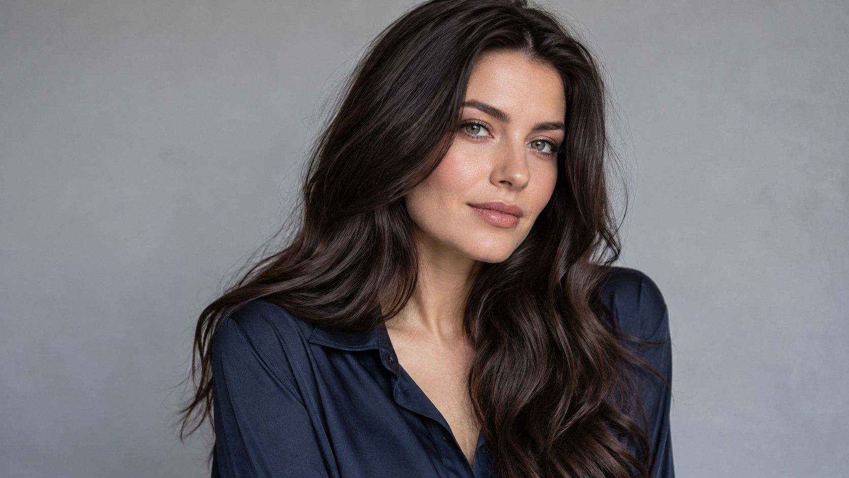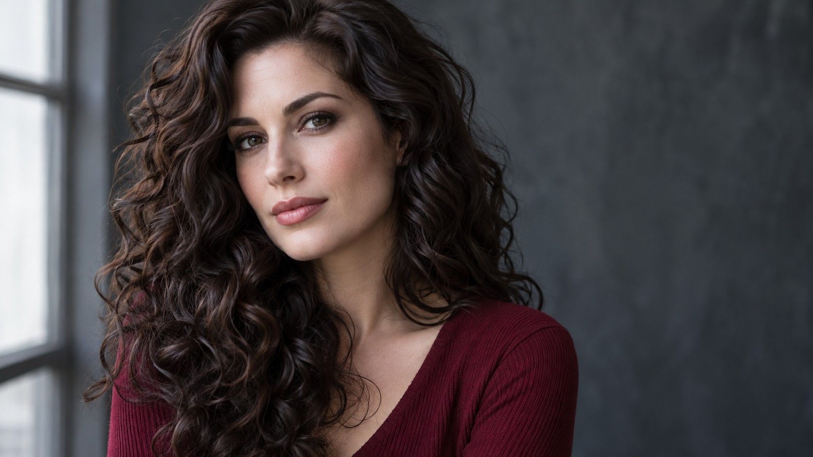
A winter palette hair color usually aims for a clear relationship between coolness, depth and contrast. That does not automatically mean dyeing your hair black. Compare a few controlled options around your natural color first, and use the season label to describe a preference rather than dictate the result.
Use the Winter label to make better comparisons
Winter in seasonal color analysis is a styling category, generally associated with cooler colors and a relatively clear or contrasting appearance. It is not the same as having pale skin, and it is not a scientific test that assigns one correct hair dye. People with a wide range of skin depths use Winter palettes.
The phrase hair color for winter skin tone can therefore be misleading. Skin has more variation than the seasonal label suggests, while hair, brows and eyes also affect the whole impression. A useful test asks which depth and tone you like beside your face. A label can help organize those examples after you have looked at them.
Start with an unedited photograph in indirect daylight, with the neck and brows visible. Avoid strong colored light from a lamp or a nearby wall. Put a neutral medium-to-dark brunette beside your existing hair color before trying dramatic shades. You need a steady reference point to recognize what each change actually does.
If you have been assigned different seasons by different online tools, do not resolve the disagreement by choosing the darkest hair option. Compare photographs instead. Notice whether you favor a defined outline, softer depth or cooler reflections. Those observations remain useful even if you later stop using the seasonal system.
Check darkness before trying to perfect the undertone
A shade that is too dark for your preference can feel heavy even if its undertone is appealing. A shade that is too light can reduce the contrast you enjoy even when it is cool. Change one variable at a time: first compare dark brown with medium brown, then compare warmer and cooler versions of the preferred depth.
Look at the border around your forehead and the sections beside your jaw. Darker hair usually increases the visible difference from lighter skin, but the effect depends on your starting features. With deeper skin, the relationship between hair, brows and complexion may be subtler. A universal instruction to create maximum contrast misses those differences.
Try viewing the previews as small thumbnails. If the darkest hair overwhelms the face in the small view, look at a slightly lighter alternative before deciding. A monochrome copy can help isolate depth, although it cannot tell you whether a red, golden or ashy reflection is what you prefer.
This is also a good point to consider your everyday style. If you like a dark, graphic frame without makeup, that is a useful preference. If you only like it after adding stronger brows and lipstick in the preview, decide whether that extra styling fits your routine. The photograph should help you notice the tradeoff.
Compare cool brown with black without losing detail
Cool dark brown is often a useful comparison for someone considering black. Both can give a defined frame, while the brown may show more visible softness in daylight. In a dim indoor photo they can look almost identical. Choose references that reveal the hair near a window rather than relying on an almost black thumbnail.
Black also covers more than one visual effect. A neutral black, a strongly blue-looking black and a very dark brown are different choices. A filter may exaggerate a blue reflection that would normally appear only under particular lighting. Check whether you want that visible effect across the whole head or merely like a cool impression.
When comparing the best hair colors for winter skin tone, include your natural shade as a serious option. A cool gloss-like effect in a preview may appeal more than a change in depth, but a photograph cannot specify the service needed. Explain the visual goal and let a colorist assess the starting hair before choosing an approach.
Going darker can also affect future choices. If you think you may want a much lighter shade soon, mention it before adding dark permanent color. Ask what a later change could involve with your dye history. A convincing black preview tells you about appearance; it does not tell you how easily you can reverse the actual color service.
| Comparison | What to keep the same | What to look for |
|---|---|---|
| Dark brown versus black | Lighting, hairstyle and face exposure | Whether extra depth gives definition or feels too strong |
| Neutral black versus blue-looking black | Overall darkness and placement | Whether the visible cool reflection is a feature you actually want |
| Fine highlights versus pale face-framing panels | Base shade and photograph | How strongly the lighter pieces separate from the dark frame |
| Current color versus a small tone adjustment | Depth and hair shape | Whether a modest change already gives the effect you wanted |
Choose highlights by the contrast they create
Highlights do not automatically conflict with a Winter palette. The relevant questions are where the lighter pieces sit, how bright they are and how distinct you want them to look. A fine cool-brown highlight and a broad pale-blonde face frame make very different statements, even on the same dark base.
If you like a clear, dramatic look, test brighter pieces at the front. If they seem to separate from your features, try narrower placement or a less extreme difference in depth. Keeping the base visible can preserve the dark frame while changing the movement through the lengths. This is a placement decision as much as a tone decision.
Gray or silver hair can also become part of the comparison. There is no requirement to cover it to fit a seasonal category. If you are growing out gray, bring a photograph showing the real root pattern and discuss the transition you want. An even silver overlay cannot simulate the exact distribution of your natural gray.
Inspect the preview with hair up and down. A light panel hidden inside loose hair may become prominent in a ponytail, while a bright fringe stays visible in almost every style. Save references that show both views when placement matters. The best hair color for a Winter palette should work in the hairstyles you actually wear.
Match the plan to roots and previous dye
Your natural root is the practical starting point, even when the inspiration picture looks straightforward. Dark dye, old highlights and different colors on the ends can complicate the route to an even cool shade. Give the colorist a clear account of what has been applied, rather than assuming the current brown photograph tells the full story.
Ask how the proposed shade may change between visits. A cool effect can look different after repeated washing and under warmer indoor light; the exact behavior depends on the hair and service. Discuss the likely upkeep and any recommended return visits before deciding that a preview represents an easy everyday option.
If you are still comparing hair colours for winter skin tones, keep the final folder small. One photo can show depth, another placement and a third the amount of cool reflection you like. Write a sentence for each. “I like this darkness but not the blue cast” is clearer than a general request to look more Winter.
Choose the option whose benefits you can name and whose practical limits you understand. A slight adjustment near your natural depth may achieve the definition you want, while a larger change may be worth the extra commitment for a deliberate new look. The season can organize the conversation, but your face, hair history and preferences should finish it.