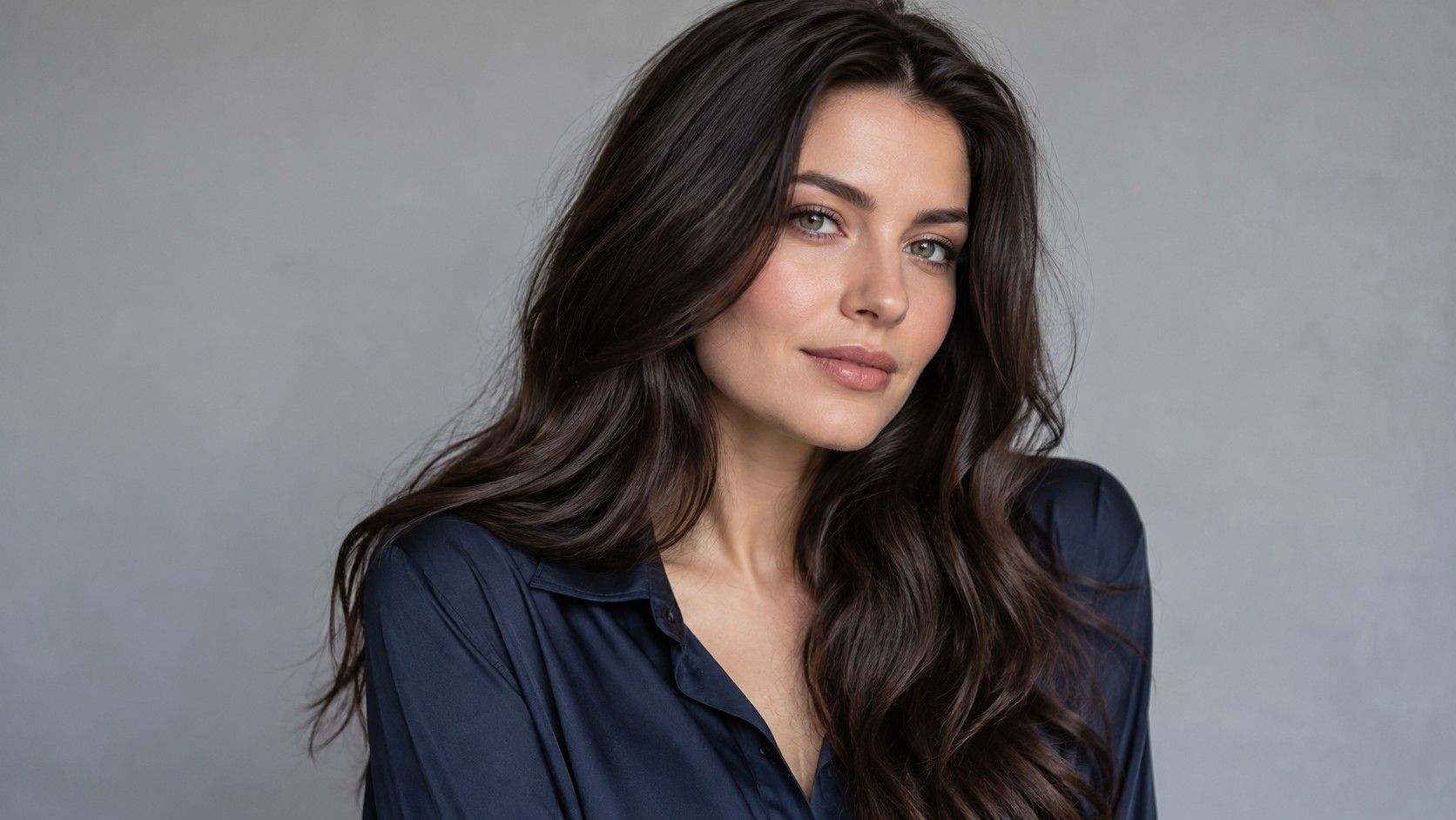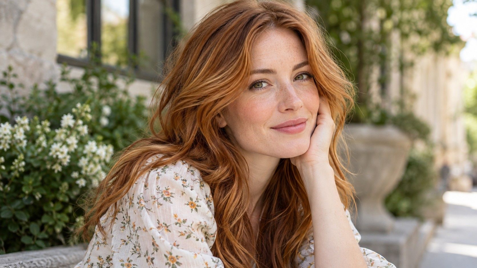
Bright Spring hair colors can be warm without being extremely blonde or vividly orange. The useful distinction is clarity: whether the shade looks fresh and defined beside your features, rather than dusty, heavy or washed out. Start with a few golden brunette, copper and blonde references at different depths. Bright Spring is a vocabulary for styling comparisons, with definitions that vary between systems. It does not provide a guaranteed personal shade, and it cannot replace a look at your starting hair and ordinary daily routine.
When bright is being confused with very light
A pale blonde can be light but muted, while a medium golden brown can look clear and lively. Compare these properties separately. First place a warm medium brown beside a similar brown with a smoky overlay. Then compare the clearer brown with a lighter golden option. This makes it easier to see whether you want less grayness, more lightness or a change in warmth.
Use a photograph where the skin has not been smoothed or brightened. Some previews make a blonde result seem more flattering by changing the face alongside the hair. Check the lips and background between versions. If they have shifted, return to an unchanged original before deciding that one shade brings more clarity to your face.
The palette label does not demand blue eyes, fair skin or naturally golden hair. Look at your actual relationship between features. If a bright shade overwhelms the eyes or makes you want heavier makeup just to restore balance, try less saturation or a different depth. You are comparing a design around a face, not trying to demonstrate that you belong to a category.
Compare golden brown with copper at the same depth
Golden brunette can be a manageable direction when you want visible warmth without an obvious red result. A warm light brown and a rich medium brown may both fit the reference family, yet frame the face differently. Start close to the natural root. If that version looks convincing, you can decide whether extra lightness would add anything useful.
Copper deserves its own comparison because it can attract much more attention. A soft copper-brown may read as brown indoors and more orange in daylight; a clear copper reference can look strongly red-orange throughout. Compare them in the same image with similar brightness. Otherwise a beautifully lit copper portrait may win because of the photography rather than the shade.
| Direction | What to compare | What to clarify |
|---|---|---|
| Golden brunette | Warmth close to your present depth | How much gold is visible beside the face? |
| Copper-brown | A red-orange reflection within a brown base | Should it read brown or copper indoors? |
| Clear copper | A stronger color statement | How will the root and faded lengths differ? |
| Golden blonde | A lighter frame that retains warmth | Does the hairline still give enough definition? |
Bring a rejected example as well as a favorite. Saying that one copper is too orange or one brunette is too dark gives a colorist a clearer target than asking for the best hair color for Bright Spring. Names such as honey, caramel and copper are broad descriptions and can conceal substantial differences.
Let blonde stay bright without erasing the face
When a golden blonde seems to wash you out, check its depth before blaming the warmth. An almost-white blonde may remove the frame you were used to seeing. Compare a slightly deeper blonde while retaining a similar golden direction. The useful version may be less dramatic in the hair alone but more balanced when you see the entire face.
Look closely at the front pieces. A broad pale band near the forehead can have more impact than lighter ends. A blended root or smaller bright sections may preserve definition without abandoning blonde. Check a photo with the hair tied back, because those front pieces often remain visible when the rest is off the face.
Warm blonde also does not mean a uniformly yellow finish. Your reference might combine a neutral base with golden reflections, or deeper roots with brighter lengths. Describe those relationships separately. A flat yellow preview cannot represent the range of light and shadow in real hair, particularly in curls or layered cuts.
Decide how much root contrast you want to see
A natural dark root with bright copper or blonde lengths creates an intentional contrast. Whether you like it is separate from whether the tone belongs to a Spring palette. Compare a version with the natural root retained and another with a more even color. Watch the transition at the temples and around the part, where a sharp line is often easiest to notice.
If your natural base is lighter than the proposed lengths, new growth can make a darker dyed color look different as it grows. If the base is deeper, a lightened look may produce the opposite effect. Ask what the chosen design will look like between appointments, not just at the finish. A realistic maintenance plan begins with that visible transition.
Previous color may make the lengths behave differently from new growth. A copper reference placed over a uniformly recolored photograph hides those differences. Tell the colorist about earlier dark dye, lightened pieces and sections that have faded unevenly. Do not try to infer a coloring formula from the edited image; the actual starting hair needs its own assessment.
Choose a reference you can recognize in everyday light
Warm evening sunlight can make an ordinary brown look strikingly golden. Indoor light can flatten a copper or exaggerate yellow. Collect references that show the general shade in more than one setting, or make your own comparisons from a daylight baseline. A result that depends on direct sunset light is a poor guide to what you will see while getting ready in the morning.
Keep your haircut and texture in mind as you save images. A straight glossy bob reflects light in wide bands; curls break the same color into smaller patches of brightness and shadow. You may love the reference because of that texture. Choose at least one example with a similar shape and density so that the color discussion stays grounded.
Put your shortlist beside clothes you already wear, especially the colors closest to your face. You do not need a new wardrobe to justify a hair shade. If you like a warm brunette with your daily shirts but only like the brightest copper with a particular styled outfit, that difference is useful. It may point toward a subtler first change.
Before booking, discuss the expected appearance as the shade changes, the root strategy and the time you can realistically set aside for upkeep. Follow product labeling and safety instructions for any coloring process. A preview can help you express preferences; it cannot assess the hair or promise that one appointment will reproduce a photograph.
The best hair color for a Bright Spring palette can therefore be a clear brown, a carefully chosen copper or a warm blonde with enough root definition. Choose the one that still makes sense after you remove special lighting, retouching and the excitement of a dramatic change. If two options remain close, a smaller shift in tone or a limited placement can give you a more useful first comparison in real life.
A small comparison on paper can help when screens make every shade look exciting. Write down the depth, reflection and placement you like for each finalist, then read the descriptions without the photos. Golden medium brown with soft face-framing brightness is a different request from vivid copper everywhere. If the words describe a much larger change than you intended, revise the shortlist before the appointment. The point is to arrive with a clear preference, not simply a folder of attractive portraits.