Cool Winter hair colors often lead to a page of dark brown and black reference photos. The difference between them can disappear on a phone screen, yet feel substantial around your face. Start by comparing depth, then the amount of red or gold you want to see. A seasonal palette can help organize that comparison, but it cannot predict an exact result or prescribe a shade for everyone who uses the label. Your natural contrast, existing dye and willingness to maintain a change deserve equal attention.
Check the contrast you already wear
Pull the hair back loosely and look at the relationship between the brows, eyes and skin. Then let it fall around your face again. The change shows how much framing the hair currently supplies. Cool Winter is often described through coolness and contrast, but contrast is a relationship between features, not a particular skin depth or ethnic background. A dark reference photo alone cannot tell you whether that relationship matches yours.
Use the root as a starting point if the lengths have been colored. It may be darker, lighter or less warm than the rest of the hair. Save a daylight photograph with both visible, without trying to make them match in editing. That difference is useful information for a consultation. It also helps explain why a dark filter can look convincing at the crown but artificial through the ends.
For the first comparison, keep your usual eyebrows and makeup. A preview accompanied by heavier eyeliner, changed skin tone and sharper brows is showing a larger makeover. You may enjoy that result, but it will not isolate the effect of hair color. An ordinary photograph gives a more useful baseline than a highly styled reference portrait.
Put cool brown beside near-black
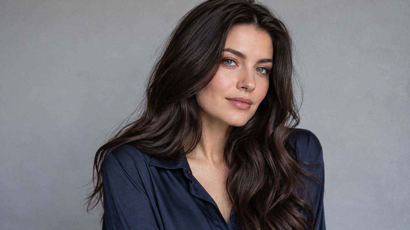
Compare a neutral-cool dark brown, a deeper espresso and a soft black in the same photo. Look at the edge of the hair against your cheek rather than the brightest patch on top. Dark brown can supply a clear frame while retaining visible detail. Near-black can create a stronger outline; it can also appear flatter when a preview erases strand variation.
Descriptive names need translating. Espresso may mean a neutral dark brown to one person and a warm brown to another. Soft black can look brown in daylight, while a blue-black reference may show a distinct fashion tone. Point to the part of the image you want: the depth at the root, the neutral mid-lengths or the cool reflection. Asking for the name alone leaves room for a different interpretation.
| Shade direction | Useful comparison | Question for the consultation |
|---|---|---|
| Cool dark brown | A defined frame with visible brown in daylight | How can the tone stay neutral as it changes? |
| Espresso brown | More depth without an obviously black finish | How different will it look from the natural root? |
| Soft black | A stronger outline around the face | What would a later move back to brown involve? |
| Blue-black | A deliberate cool reflection | Will the blue be visible in ordinary indoor light? |
If all three options look identical, the image is too dark to judge. Use a brighter original photograph instead of turning up saturation. A near-black preview that blocks out the curls, layers or fringe is concealing part of the decision. You need to see both the facial effect and the shape of the hair.
Try blonde as a placement decision
Cool blonde is sometimes presented as the automatic alternative to dark Winter hair. It changes the overall contrast substantially, especially when the natural base is dark. Before trying a full pale blonde, compare a small bright section, a few fine highlights and a more extensive lightening effect. Keep the surrounding brown or black visible in each version.
Placement near the face can have more impact than a larger amount of lightness hidden underneath. A pale streak beside the temple may catch attention every time you tie the hair back. Check the preview with a central part and your usual part, if the tool permits. A reference that works with hair worn forward may look very different behind the ears.
There is no requirement to choose blonde simply because you want a noticeable change. A tonal adjustment, a different depth or dimension through the ends may be enough. If pale blonde is the goal, ask what your present color history permits and how the root transition will look. A digital blonde is a design experiment, not an assessment of what the hair can achieve in one visit.
Tell warm reflection from a warm overall tone
A shiny strip of dark hair often reflects the light source. Under a yellow bathroom bulb that strip can look amber even when the rest looks neutral. Photograph the same area near a window with no direct sunlight. If only the highlight changes, the lighting may explain more than the underlying shade. Do this before deciding that every trace of warmth needs correcting.
A consistent red or orange cast through the mid-lengths is a different observation. Note whether it is strongest in older color, at the ends or throughout. Bring those details to the appointment rather than asking for the coldest possible color. A colorist can evaluate the starting base and discuss a realistic tone; a screen cannot show the full condition or coloring history.
Blue or violet reflections in a reference image also deserve scrutiny. They may come from the color, nearby objects, editing or studio lighting. Save more than one photograph of the same general shade direction if possible. You want a result that makes sense in daylight and indoor light, rather than a reflection that appears for one camera angle.
Choose upkeep before committing to the deepest option
Darkening can feel like the straightforward choice because the preview looks immediate and even. Yet future changes matter. Discuss what would be involved if you wanted a lighter brown later, particularly over previously colored lengths. Do not assume that choosing black now leaves every lighter option equally easy afterward. The relevant answer depends on the actual hair and color history.
Root visibility is another separate choice. A lighter or grayer root beside dark lengths can produce a clear line as it grows. A shade closer to the natural base may make that line less conspicuous. Ask how the proposed depth would age between appointments, and be honest about the time and budget you expect to give it. No universal appointment schedule suits every head of hair.
Bring two favorites and one rejected reference. Explain why the rejected one fails: too blue, too flat, too heavy around the fringe, or too much pale contrast. Those descriptions are more useful than demanding the best hair color for a Cool Winter skin tone. They give the consultation a concrete starting point without treating a palette label as proof.
End the comparison at normal viewing distance. A shade that only wins when zoomed into the hair may lose when you see the whole face. Keep the original photo beside the final choice, look again the next day, and choose a smaller shift if the decision still feels uncertain. The goal is a color you recognize yourself in, including on days without the styling shown in the reference.
A fringe deserves a separate look because its color sits directly above the eyes. Darkening a full fringe may make the frame feel stronger than darkening long sections kept behind the shoulders. Conversely, a few pale pieces in a fringe can become much more noticeable than the same pieces through the back. Include the way you normally part and dry your hair in the reference. A color designed around a different cut may be the source of the mismatch, even when its temperature looks right.