True Autumn hair colors span more than copper. Chestnut, golden brown, caramel details and restrained red-brown can all offer different kinds of warmth. The hard part is choosing how much warmth to show and how deep the overall frame should be. A True Autumn palette is a styling framework, not a guarantee that a particular dye will suit you. Use it to narrow references, then compare the shades against your own features, your existing root and the color history through the lengths.
Separate a warmer tone from a darker result
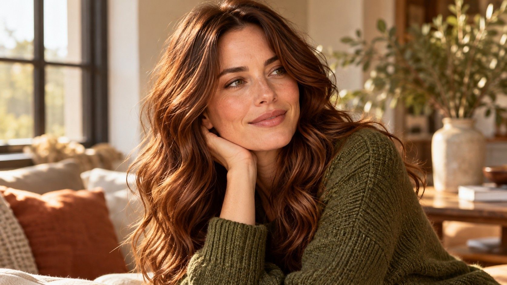
When a warm brown reference appeals to you, ask whether you like its depth or its copper-gold reflection. Compare it with a neutral brown at the same depth. Then compare a lighter warm version. This gives you two distinct decisions instead of one broad request to make the hair more autumnal. The deeper shade may look rich in isolation but put too heavy a frame around the face.
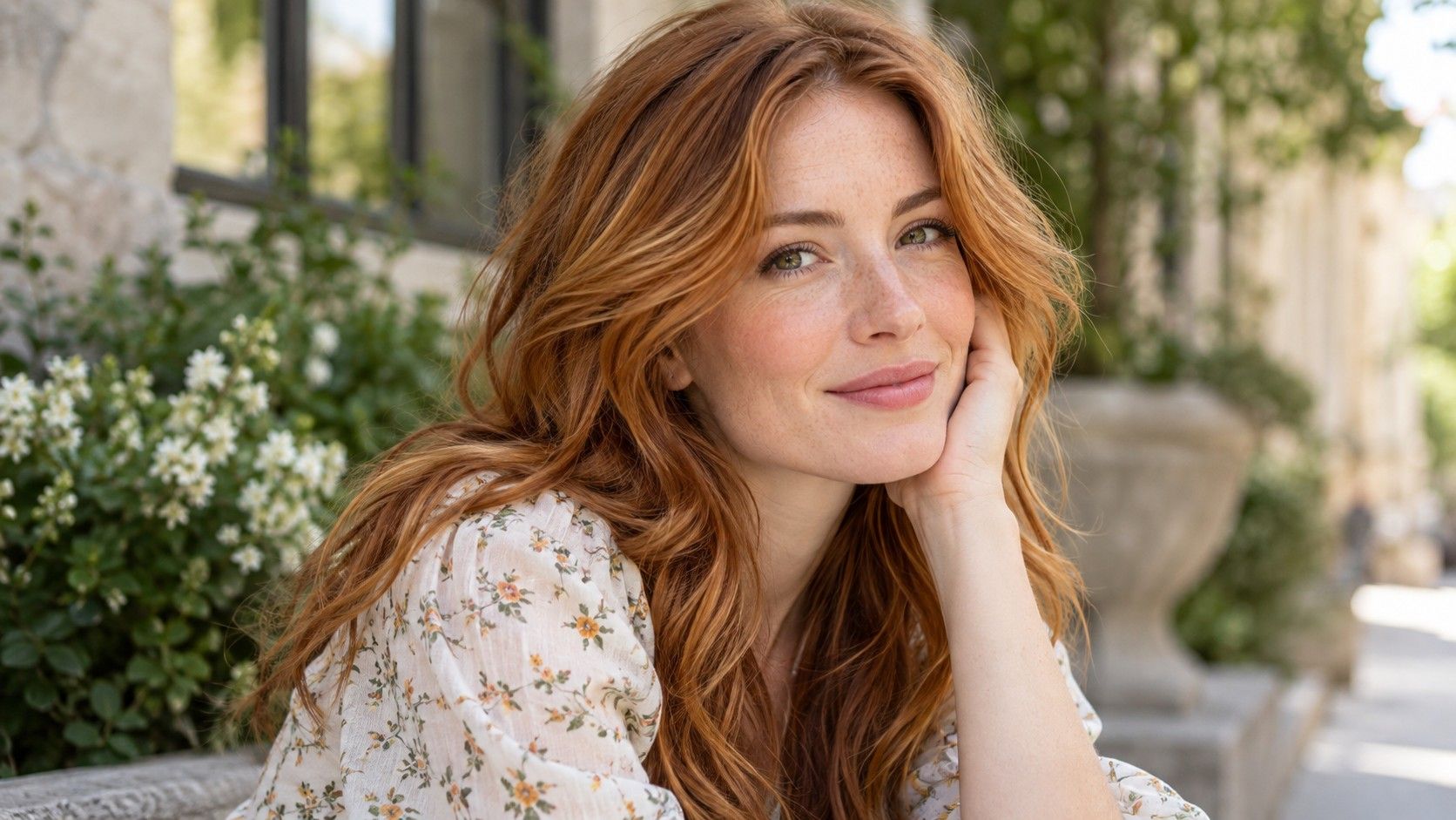
Warmth is also broader than orange. A golden light brown, a red chestnut and a copper-brown can all read as warm, yet look very different beside the cheeks and eyebrows. Keep these reference families separate at first. Trying a succession of increasingly saturated coppers is not a useful test if the original preference was simply a softly golden brunette.
Natural coloring does not have to match a stereotyped Autumn portrait. People using the same palette name can have different skin depths, hair textures and contrast between features. Look at the result on your own unretouched photo rather than borrowing a conclusion from someone whose coloring looks similar. A seasonal name is a convenient starting label, not an instruction to change your appearance.
Choose between chestnut and caramel by placement
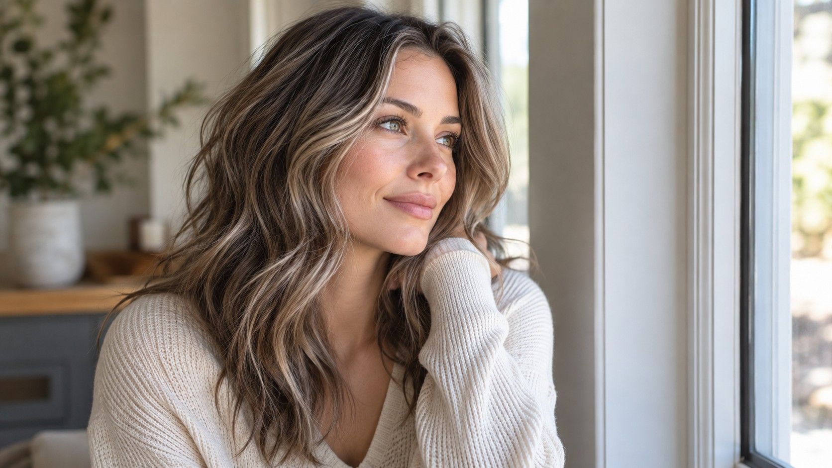
Chestnut usually suggests a brown base with some red warmth, although the name varies across references. Caramel often describes a lighter golden-brown effect and is frequently shown as highlights. An all-over chestnut and caramel pieces through a deeper base are therefore different designs. Compare them at the whole-head level rather than treating them as competing swatches.
For a quieter change, look at warm brown close to the root depth with limited lighter sections. Check whether the brightness sits around the face, through the ends or underneath. A pale front piece can change the facial frame much more than a larger amount of caramel hidden in the back. Placement matters when you want warmth without the feeling of becoming substantially blonde.
| Reference family | Useful starting question | Potential mismatch |
|---|---|---|
| Golden medium brown | Would a little warmth be enough? | The photo is golden only because of sunset light |
| Chestnut | Do you want visible red within brown? | The chosen image is much darker than your preference |
| Caramel dimension | Where should lighter warmth appear? | The front pieces remove more contrast than expected |
| Copper-brown | Should the result read copper indoors? | You like the brown base but dislike the orange reflection |
At the appointment, show which part of the reference you mean. Pointing to a golden highlight while describing the photo as chestnut can send the conversation in two directions. A few precise observations about depth, placement and reflection help more than a long list of seasonal shade names.
Consider copper from the base you have now
A copper preview on a light starting photo may look translucent and bright. The same direction on a deeper brunette can read as copper-brown, depending on what is possible with the actual hair. Do not treat an app overlay as evidence that your current color will become the reference in a single step. Existing dye and previous lightening need to be part of the assessment.
Compare softer copper-brown with a clearer copper before deciding how bold to go. Look at both near the forehead and beside the jaw. The stronger version may be exciting in a cropped image but dominate once the whole face is visible. A more restrained copper can leave room for your eye color and brows, without making the hair look neutral.
If the ends and roots are different colors now, record that in daylight. Write down the history you remember, including older dark color and highlights. A colorist can then discuss how the sections may differ and whether a strand test is appropriate. Avoid choosing a formula or developer strength from a seasonal chart; the chart does not know what is on your hair.
Keep deep brown from swallowing soft detail
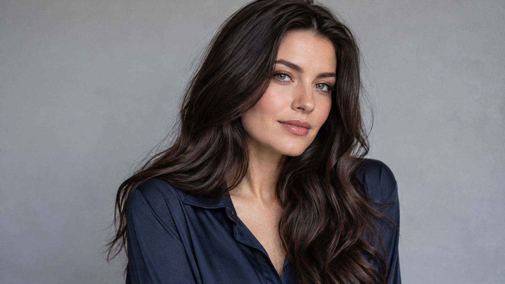
Dark warm brown can look polished in a studio portrait and much heavier in ordinary indoor light. Before selecting it, compare a version slightly closer to your natural depth. Look at whether you can still see separation between layers and movement in the ends. If a filter turns the hair into a single dark shape, use a better reference rather than assuming the shade itself must be wrong.
Check your eyebrows and normal makeup routine. A deep brown that seems balanced only with newly darkened brows or strong eye makeup is part of a larger appearance change. You may want that, but it deserves a deliberate choice. Try the shade with the face you usually present on an ordinary day, then decide whether the added depth feels natural or demanding.
Dimension can reduce the impression of a solid dark frame. It need not mean large blonde streaks: slight variation in warm brown can show the haircut while preserving an overall brunette appearance. Bring a reference with similar texture where possible. The same placement looks more separated on straight hair and more broken up through curls.
Build a consultation reference that survives normal lighting
Collect a small set of images: one for overall depth, one for the warmth you like and one showing an effect you want to avoid. Three focused references are often easier to discuss than a large folder that mixes strawberry blonde, dark auburn and caramel balayage. Add a plain-language note such as brown indoors, copper reflection in daylight, or gentle brightness through the ends.
Photograph your own hair near a window without direct sun. Keep a neutral top around the face, turn off beauty effects and retain the original image. If you make try-on versions, compare them from that same original so that skin exposure and background color remain consistent. A warmer face in one edit can change your preference even if the hair difference is small.
Look again in your usual indoor setting. You do not need the shade to appear identical under every light; reflected color naturally changes. You do need to know whether you like its ordinary range. A caramel reference that is beautiful only in a sunbeam may be less useful than a quieter brown you enjoy both indoors and beside the window.
Discuss maintenance in terms of the result you want to keep. Ask how root growth, tonal change and existing lightened pieces may affect the appearance between appointments. State the time and budget you expect to spend, and follow product labeling and safety directions for any coloring process. A seasonal palette cannot determine the right schedule or assess the state of the hair.
For someone uncertain between copper and brown, the best hair color for True Autumn may be a warm brunette with enough red or gold to test the direction. Someone already comfortable with visible warmth may prefer a more obvious copper. Keep the decision proportional to your confidence. The final reference should describe a color you want to live with, not simply the most autumn-looking photograph in the folder.