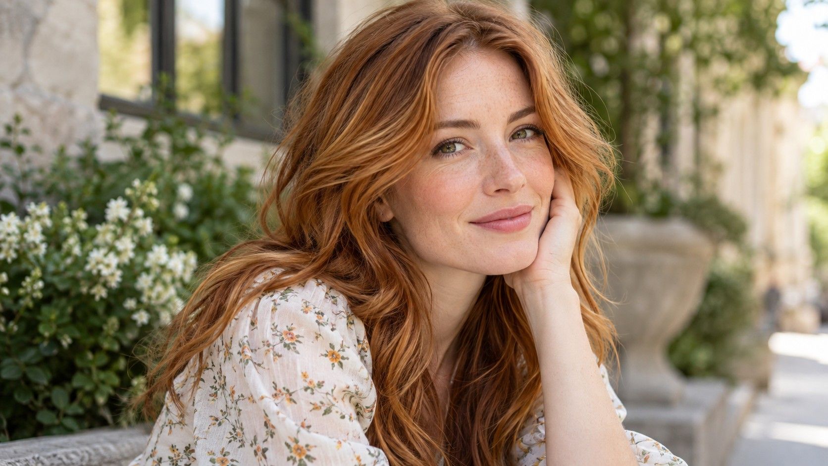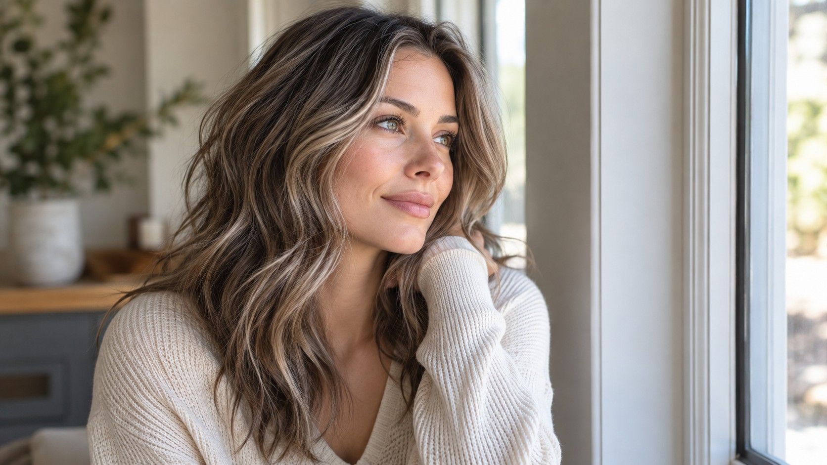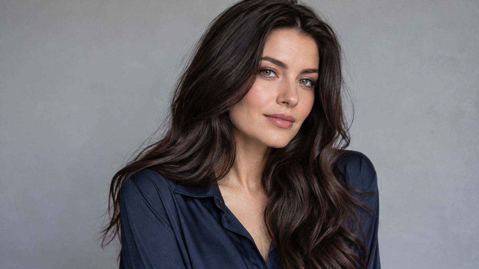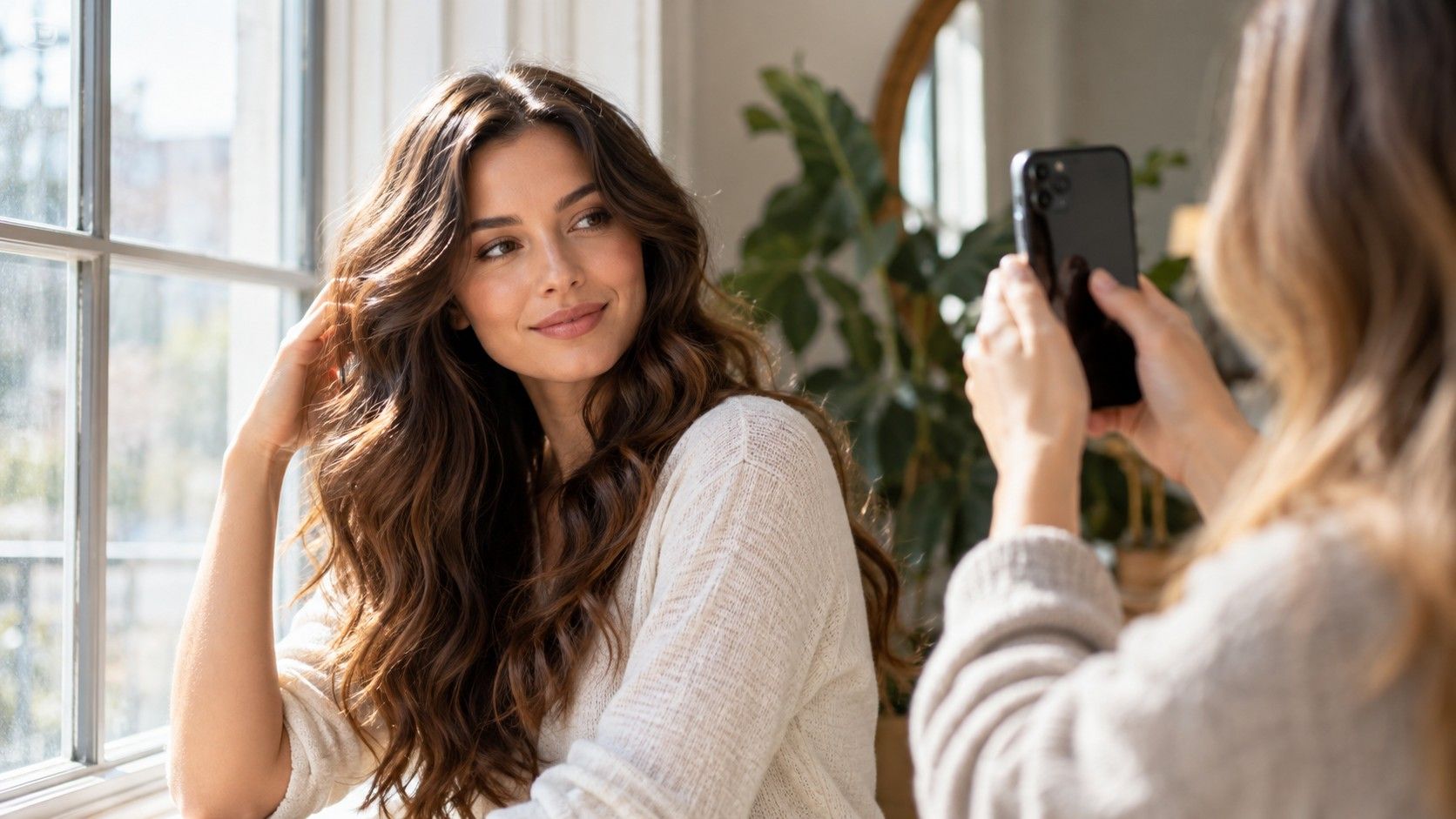
Before you test hair color on a photo, check the photograph itself. A warm ceiling lamp, a bright window behind you or an automatic beauty effect can influence the result more than the shade button you choose. A hair color filter is useful for comparing ideas when the original image stays believable. Give the photo a few minutes of attention first, then judge the differences with one variable changing at a time.
Find even light rather than the brightest light
Stand near a window where daylight reaches your face indirectly. Turn so the light falls across the front of the hair without creating a bright strip on one side and a deep shadow on the other. Direct sun can produce strong reflections that disguise the underlying shade. You want visible strand detail across the areas you plan to recolor.
Turn off nearby lamps if they add a different color of light. A warm bathroom bulb mixed with daylight can make one section appear more golden than another. Move away from colorful curtains and walls, which may reflect a tint into the image. A plain wall is a practical background because it also helps you notice obvious camera color shifts.
Look at the photograph before opening a hair colour filter. Does the skin look roughly as it does in the mirror? Can you distinguish the roots, lengths and ends? If pale areas have become featureless white or dark sections have collapsed into solid black, take another picture. Editing a poor baseline may make it prettier without recovering the information you need.
A second photograph on another day can be useful later, especially if your first result seems surprising. For the initial comparison, however, stay with one image. Switching both photograph and hair shade at the same time creates two possible explanations for every change in your preference.
Keep your face and the original file unchanged
Save an original copy before trying any shades. Use the same crop, orientation and expression for each version. Keep enough of the shoulders and hair ends in view to understand the whole result. A close crop may make a bold color look manageable while hiding how much of it would appear below the face.
Beauty modes and portrait effects can blur stray strands or change the shape of the face. Disable them where possible. Background blur can also soften the hair boundary, making the filter appear cleaner than it really is. A normal photograph with a few flyaways is more useful than an image whose hairline has already been heavily processed.
If the application adjusts the skin or lighting when a shade is selected, compare the output with your saved original. Check the cheek, forehead and whites of the eyes. Changes in those areas can make a hair shade look flattering for reasons unrelated to hair. Prefer a setting that lets you evaluate the color while keeping the face consistent.
Read the hairline before trusting the thumbnail
Open a preview large enough to inspect the parting, temples and ears. Those areas contain fine strands and difficult boundaries between hair and skin. A colored patch on the forehead, a bright halo around the head or an unchanged band of roots can distort the impression. Do not judge a shade from a thumbnail that conceals these problems.
Look at the ends as well. If they overlap clothing, the filter may recolor part of the shirt or miss fine strands completely. Curly and textured hair can contain small gaps through which the background shows. A smooth painted shape that fills those gaps may change the apparent volume as well as the color.
Masking quality and shade preference are separate questions. You may still learn that you like a cooler brunette direction from an imperfect mask. Keep that conclusion modest and note the fault. If the whole face-framing section is inaccurate, use another photo rather than treating a distorted border as a realistic new hairline.
Check reflections across the crown and lengths. In a useful simulation, the hair should retain some believable variation. When every strand becomes equally bright, a blonde may seem lighter than a real result; when shadows disappear under an opaque dark overlay, a brunette may seem flatter. The filter is changing an image, not reproducing the behavior of individual hairs.
Compare depth, then tone, then a bolder idea
Begin with a shade near your current depth. That gives you a way to judge whether the filter preserves the original texture and exposure. Next compare a slightly deeper and a slightly lighter option with roughly similar tone. If you skip directly from dark brown to bright copper, you cannot tell which part of the transformation you prefer.
Once the depth feels right, compare a warmer, cooler and more neutral version. Watch the face rather than trying to name your undertone from the screen. Does one option feel more connected to your usual style? Does another create a contrast you enjoy? These are aesthetic decisions, and you do not need to turn them into a permanent seasonal identity.
Use vivid colors as a separate exploration. A saturated red or violet overlay can be enjoyable without being a realistic prediction for your current hair. Its apparent brightness may depend on the underlying picture and the application. Save it as an inspiration direction and discuss the real starting base before assuming you could reproduce it.
Keep the screen display steady during close comparisons. A strong night tint can shift your perception of cool and warm shades. Very high brightness may make pale options look unusually luminous. A normal screen is still an imperfect color reference, but consistent settings make your own comparison less arbitrary.
Save enough evidence to remember your choice
Choose three versions that represent different, understandable directions. Add a short note to each: neutral brown at current depth, softer blonde around the face, or deeper root with lighter lengths. Those descriptions are more useful than a long row of unnamed screenshots. Include the shade label if the tool supplies one, while remembering that labels vary between systems.
Place the original next to the three previews at equal size. Look away for a while, then return to the set. A dramatic shade can win the first comparison simply because it is new. If you still like it later, note exactly why. You may love its depth but prefer a less saturated tone, which is a much clearer request than “make it like this.”
When using a free hair color filter, check current saving limits and upload terms before relying on it for your final comparison. A service may allow a preview without offering an unmarked export, and its handling of face photographs deserves attention. There is no need to upload more photographs than the task requires.
The best hair color filter for your purpose is one that keeps the comparison legible. A large catalog, polished animation or dramatic before-and-after presentation does not prove better shade prediction. Choose based on how well the output preserves your face and hair detail, then keep your claims about the result limited to visual preference.
Translate the picture into a real coloring discussion
A photo cannot reveal the full history of the hair, assess its response to lightening or identify a formula that will produce the preview. Bring the original image and your color history to a consultation. Point to the parts you like: cooler ends, a softer root transition or brightness concentrated beside the face.
Ask what can be achieved from your current base, what might need several stages and what the result would look like as it grows or fades. A preview has no calendar and no regrowth. The real decision includes the visits and care required to keep the effect you are choosing.
If you plan to use home dye, follow the instructions and testing guidance for that exact product. The filter provides no evidence about a product reaction or the condition of your hair. Its job ends with a clearer picture of your preferences. With a sound photograph and a small shortlist, that is already useful work.